Case Study
Reimagining Student Onboarding: Fixing the Admissions Journey Before Students Got Lost
Identified a structural issue generating avoidable support load, designed the solution before the first stakeholder meeting, and used the project to extend the University's existing content block system with new capabilities.
Visit Webpage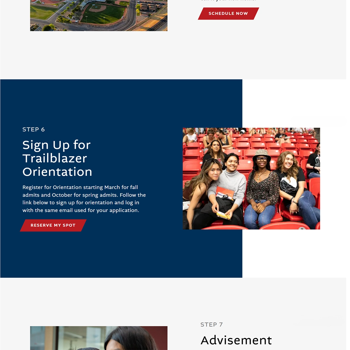
On this page:
Overview
The Admissions team had been receiving a steady stream of support inquiries from students who couldn't find information already on the onboarding page. The working assumption was that the content needed updating. After looking at the page, the issue was something else and worth fixing.
I scheduled a meeting with the Admissions team, came in with a fully designed layout, and walked them through how I planned to solve it. The proposed structure prompted them to overhaul their content completely, rethinking not just what they had written, but how they presented the onboarding process. We worked through that process together, with me guiding structure and consistency as the new content came in.
The project also allowed me to find what I'd been looking for: a real, complex page to validate new block types I was developing to extend the University's existing content block system, adding capabilities it didn't have, pushing it in a new direction, and improving some of what was already there. I built both things simultaneously, which made the design constraints harder. The solution couldn't be a one-off fix. Every decision had to be generalized.
Role & Responsibilities
I led the project end-to-end, handling both the technical implementation and the UX decisions.
My duties included:
- Technical project leadership: managing scope, timelines, and communication between the Admissions team and the web team
- Full-stack WordPress development: building the page on a custom theme I had previously refactored and maintained for the University
- UI/UX design: designing a streamlined, responsive layout that guided users through a clear, linear onboarding flow
- Content structure consulting: working with the Admissions team to simplify messaging, reduce redundancy, and keep the page usable despite a large volume of required content
Discovery & Strategy
The page's content was largely sufficient. The structure wasn't. Information had accumulated over time without a coherent organization, making it difficult to scan and harder to use on smaller screens. Users weren't missing answers; they were getting lost before they found them.
That distinction changed the solution. Adding or rewriting content wouldn't fix a navigation problem. The page needed a structure that made information easy to find without requiring users to hunt for it. Once the Admissions team saw the layout, they reached the same conclusion about their content and started from scratch rather than trying to fit old material into a new shape.
Design & UX
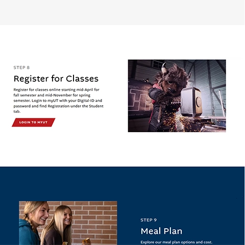
I designed the page as a simple, scroll-based layout that guided users through onboarding in an ordered sequence. The page sequence became the navigation. Users didn't need to jump between sections or hold a mental model of the page's organization. They just followed the flow.
The bigger challenge was content volume. The Admissions team had a significant amount of required information that couldn't be cut, and their overhaul produced detailed, policy-heavy material that had to be handled carefully. Rather than treating volume as a problem to design around, I treated it as a given and built a structure that could handle it. Each block had clear rules for what it could contain and how it would behave, keeping the layout stable regardless of how much content it held or who later edited it.
The layout didn't just reorganize what was already there. It gave the Admissions team a new framework for thinking about their content entirely, and the structure held up as they rebuilt everything from scratch.
The original page prior to redesign. Three numbered accordion sections with no visual guidance, photography, or student-first framing.
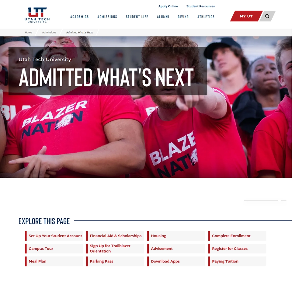
The redesigned experience. Photography, clear sequencing, and a visual system that acknowledges the student's context rather than processing them through a checklist.
Step card — desktop

Step card — mobile
Technical Implementation
The page was built in WordPress using ACF and a custom theme I had previously refactored for the University. The new blocks were designed to plug into the University's existing block system, extending it rather than replacing it. This project was their first real test in production, which meant the implementation had to be solid enough to justify rolling the blocks out more broadly.
The work touched three areas of the existing system: adding block types it didn't previously support, extending its capabilities in a new direction, and improving the behavior of some existing components along the way.
Key decisions included:
- Content decoupled from layout: block structure was defined independently of content, so the layout stayed stable as the Admissions team revised and rebuilt their copy throughout the build
- Responsive behavior at the component level: rules were built into the blocks themselves rather than patched per page, so that the same components would behave consistently across future deployments
- Analytics from the start: Google Analytics and Microsoft Clarity were integrated at the beginning to track whether the structural decisions were working after launch
- Iterative refactoring: as content length varied across sections, I worked back through the block internals to handle edge cases without breaking the shared interface
Because the blocks were built for reuse, the implementation had to stay clean enough that other pages could use them without inheriting the quirks of this one.
Process & Collaboration
I worked directly with a primary contact in the Admissions department, who coordinated content and feedback from their team. We met regularly throughout the project and made changes as the content evolved, rather than trying to complete everything up front.
Because the page depended heavily on information from multiple people, the content often changed during the build. That meant the layout had to stay flexible, and I had to adjust the structure several times to keep the page usable as new requirements were added.
The Admissions team needed to include a large amount of required content, while my focus was on keeping the experience clear and usable. The final layout came from working through those trade-offs rather than forcing a purely design-driven solution.
In total, the project took roughly 150 combined hours, with about 60–70 hours on the web side (mostly my work) and the rest spent by the Admissions team gathering, reviewing, and revising content.
Results & Impact
After launch, support requests related to the onboarding page dropped to near zero. Users could find what they needed without contacting the Admissions team, freeing staff to attend to more complex student issues rather than answering the same questions repeatedly.
The page has needed only minor text updates since launch. The structure has stayed unchanged, a signal that the component abstractions held up as content kept evolving around them. When the system is working, it stops generating noise. That was the clearest measure of success available.
Long-Term Impact
The blocks built for this project have since been integrated into the University's broader content system. Other pages can now use the same architecture without rebuilding layouts from scratch, reducing future work costs and extending what the platform can support.
The project also improved the University's web infrastructure by moving it toward a more consistent foundation. Pages built on the same block system share the same structural rules, making them easier to maintain and less likely to drift apart as different teams add content over time.
With clearer defined content standards built into the component structure, similar pages can be built faster and with fewer layout issues, without requiring the same level of hands-on oversight this page required.
Reflection
The original problem was a page that wasn't working. The deeper opportunity was a web platform without a consistent underlying structure. Solving both at once meant treating a single-page redesign as a more extensive architectural decision, one that needed to generalize from the start rather than fix what was immediately in front of me.
The result was a page that solved the immediate problem, a content framework that changed how the Admissions team thought about their own material, and a system extension that compounded well beyond the original scope.
View Webpage